Let’s talk logos. You know, that little symbol or wordmark that represents your brand and sticks in people’s minds. Sounds easy, right? Well, not exactly. Designing a great logo is like trying to make the perfect cup of coffee—simple in theory, but one small mistake can leave a bad taste. If you’re new to logo design (or just trying to avoid the common pitfalls), grab a seat. We’re going to dive into the mistakes many beginners make and how you can steer clear of them.
Now, I’ve been there. When I first dipped my toes into logo design, I thought, “How hard could it be?” Oh, but it can be. Here are the traps I fell into, plus a few I’ve seen others stumble over. Let’s save you the trouble!
1. Overcomplicating the Design
This is probably the number one mistake most of us make. When you start designing a logo, the temptation to add all the bells and whistles is real. I mean, why settle for just a simple image when you can throw in gradients, shadows, and, oh hey, maybe a 3D effect too?
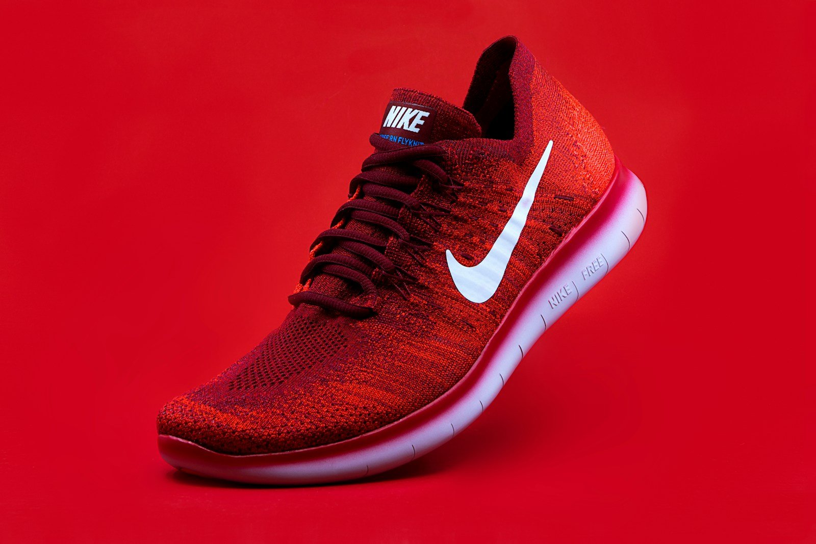
But here’s the thing: simplicity wins every time. Just think about logo designs like Nike, Apple, or McDonald’s. They’re so basic, yet unforgettable. Why? Because a logo needs to be instantly recognizable. Imagine trying to make out tiny details on a business card or a smartphone screen—it doesn’t work, right?
Avoid this by:
- Sticking to clean, simple designs.
- Prioritizing readability and recognizability.
- Testing how your logo looks when it’s shrunk to a small size (trust me, this matters).
2. Using Too Many Fonts
Look, I love fonts as much as the next designer, but too many in a logo can quickly turn into a hot mess. Once, I tried mixing three or four fonts in one logo just to “make it stand out.” Spoiler alert: it didn’t. It looked like I couldn’t make up my mind!
When designing a logo, consistency is key. Stick to one font or two at most (and they should complement each other).
Avoid this by:
- Choosing a clean, professional font that matches the brand’s tone.
- Avoiding overly decorative fonts (they’re a nightmare to read).
- Using hierarchy if you need to distinguish between different text elements (like company name vs. tagline).
3. Ignoring Scalability
Imagine this: you’ve designed a logo that looks fantastic on your computer screen, but when it’s blown up on a billboard, it’s all pixelated and blurry. Or, when it’s shrunk down for a social media profile pic, it becomes an unrecognizable blob. I’ve been there, and trust me, it’s frustrating.
A logo needs to look good at any size—whether it’s on a tiny business card or a massive signboard.
Avoid this by:
- Designing in vector format (hello, Adobe Illustrator!).
- Testing your logo at different sizes before finalizing it.
- Ensuring your logo can work in black and white as well as in color (you never know when it’ll need to be printed in monochrome).
4. Following Trends Blindly
Okay, I get it—keeping up with LOGO design trends is fun. But here’s the deal: what’s trendy today might look outdated in a year or two. Remember when the “flat design” trend hit the scene? It was great, but many of those logos feel a little stale now.
A logo is meant to last, so focus on timelessness over trendiness. Your brand isn’t a fashion statement; it’s something that should stay relevant for years to come.
Avoid this by:
- Opting for classic design principles over fleeting trends.
- Creating something unique and tailored to your brand.
- Avoiding the urge to mimic the latest big-name brands’ logo styles.
5. Ignoring the Brand Identity
Your logo isn’t just a pretty picture. It’s the face of your brand. If it doesn’t reflect the personality and values of your business, you’re missing the mark. A cutesy, playful logo design might work for a toy store, but not so much for a serious law firm.
I once worked with someone who insisted on using a rainbow of colors in their logo because they liked how it looked—fair enough. But they were running a luxury brand, and the design just didn’t match the sophisticated vibe they were going for.
Avoid this by:
- Understanding your brand’s personality before starting the design process.
- Asking yourself if your logo design conveys the right message.
- Getting feedback from others (sometimes we’re too close to the project to see clearly).
Bonus Tips for Logo Design Success:
- Test Your Logo design in Different Settings: See how it looks on business cards, websites, merchandise, and social media. It should be versatile!
- Use Color Wisely: Colors evoke emotions. Blue might feel trustworthy, while red can evoke energy. Choose wisely based on your brand’s values.
- Make it Memorable: Your logo should stick in people’s minds. Avoid overly generic designs that blend into the crowd.
Conclusion
Logo design might seem like a walk in the park at first, but it’s easy to fall into these beginner mistakes. Whether it’s overcomplicating things or blindly following trends, these pitfalls can take your design from standout to forgettable real quick.
So, next time you sit down to create a logo, remember: to keep it simple, scalable, and true to your brand. And don’t be afraid to experiment! Design is all about learning, tweaking, and perfecting.
Learn why a professional logo is the key to your business’ success

